What's New in Qt 5.1: The Qt Quick Controls
Introduction
Qt Quick and the QML language are ideal for developing touch screen user interfaces. However, the standard QML visual elements are quite low level, offering building blocks like rectangles, for example. For mobile and embedded applications you often have to build up your own components even for things as simple as a push button. This can mean reinventing the wheel on each project. Nokia developed the Qt Quick Components for Harmattan and MeeGo but these platforms are no longer being supported by Nokia. For desktop it is even more challenging as there are no QML elements corresponding to the desktop widgets.
The Qt 5.1 release contains a new module known as the Qt Quick Controls. These provide a set of reusable UI components similar to Qt's widgets that can be used from QML. This long awaited module makes it much easier to develop desktop type applications using QML, something that was hard to do using just the low level QML items provided up to now. Some of the advantages of the Qt Quick Components include:
- Using QML is now a viable option for desktop applications.
- You no longer need to develop your own high level QML components, like push buttons, from primitive QML items.
- You can easily mix the desktop components with the existing QML components, something that is harder to do with widgets.
- Your applications can now use standardized components with the possibility in the future of developing for both desktop and mobile/embedded platforms using the same source code.
In Qt 5.1 the controls target desktop platforms. Later releases (i.e. Qt 5.2) will include more features that will be useful on touch devices, possibly including theming support for other platforms such as Android, iOS and Tizen to make the components look like native widgets there.
Supported Controls
The provided components include those used to describe the basic window properties of an application, for supporting navigation and views and controls that are in most cases analogous to Qt's desktop widgets. The following table lists the available components.
| Name | Description |
|---|---|
| Action | An abstract user interface action that can be bound to items |
| ApplicationWindow | A top-level application window |
| Button | A push button with a text label |
| CheckBox | A checkbox with a text label |
| ColumnLayout | Dynamically arrange items in a column |
| ComboBox | A combined button and popup or drop-down list |
| ExclusiveGroup | Provides a way to declare several checkable controls as mutually exclusive |
| GridLayout | Dynamically arrange items in a grid |
| GroupBox | Provides a group box frame with a title |
| Label | A text label |
| Layout | Provides attached properties for items pushed onto a GridLayout, RowLayout or ColumnLayout. |
| Menu | Provides a menu component for use in menu bars, as context menu, and other popup menus |
| MenuBar | Provides a horizontal menu bar |
| MenuItem | Provides an item to add in a menu or a menu bar |
| MenuSeparator | Provides a separator for items inside a menu |
| ProgressBar | A progress indicator |
| RadioButton | A radio button with a text label |
| RowLayout | Dynamically arrange items in a row |
| ScrollView | Provides a scrolling view onto another Item |
| Slider | Provides a vertical or horizontal slider control |
| SpinBox | Provides a spin box control |
| SplitView | A component that lays out items horizontally or vertically with a draggable splitter between each item |
| Stack | Provides attached properties for items pushed onto a StackView |
| StackView | Provides a stack-based navigation model |
| StackViewDelegate | A delegate used by StackView for loading transitions |
| StatusBar | Contains status information in your app |
| Tab | Represents the content of a tab in a TabView |
| TabView | A control that allows the user to select one of multiple stacked items |
| TableView | Provides a list view with scroll bars, styling and header sections |
| TableViewColumn | Used to define columns in a TableView |
| TextArea | Displays multiple lines of editable formatted text |
| TextField | Displays a single line of editable plain text |
| ToolBar | Contains ToolButton and related controls |
| ToolButton | Provides a button type that is typically used within a ToolBar |
There are also some controls that are still marked as experimental: a Dialog component and a Dial widget.
Basic Usage
To use the new controls you need to import QtQuickControls 1.0. These are part of the latest version of Qt Quick so you also need to import QtQuick 2.1.
The controls typically provide properties and signals. For example, the Button control supports about a dozen unique properties such as text and/or an icon, tool tip string, text color and the ability to be checkable. It emits the clicked() signal when clicked on.
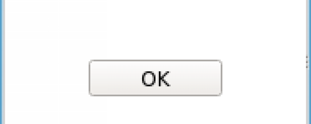
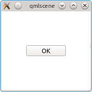
The following simple example displays a window containing an OK button which will cause the application to exit when you click it:
import QtQuick 2.1
import QtQuick.Controls 1.0

Item {
    Button {
       text: "OK"
       anchors.centerIn: parent
       onClicked: Qt.quit()
    }
}
Running this under the "qmlscene" program produces the output shown below:
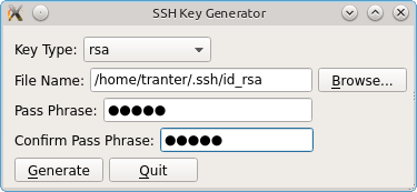
There are also some new layout components: GridLayout, RowLayout and ColumnLayout. These provide a way to dynamically arrange components based on properties such as minimumWidth, preferredWidth and maximumWidth and are analogous to Qt's widget-based layout managers like QGridLayout. To use these components you need to import QtQuick.Layouts 1.0.
Below is a simple prototype I wrote of a QML GUI that uses some of the layouts as well as controls.
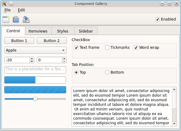
More Examples
The source code includes about a dozen Qt Quick Controls examples including a gallery of the available components and a template that can be used for desktop applications. A screen shot for the gallery example is shown below:
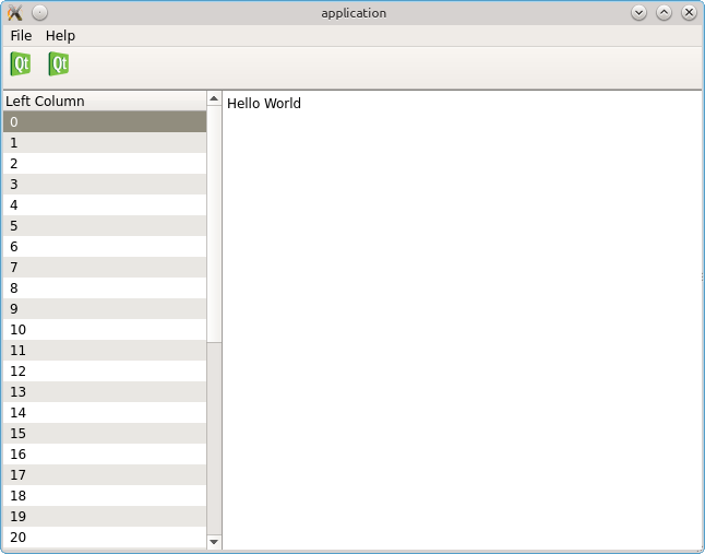
Below is a screen shot of the sample application template. The application is implemented with only about 40 lines of QML code.
Summary
The new Qt Quick Controls in Qt 5.1 offer widget-like QML components, something many Qt developers have been waiting to be included in Qt for some time.
There is a facility for styling the controls. See the documentation for the ButtonStyle component for an example of how to do this. The other style components are CheckBoxStyle, ComboBoxStyle, ProgressBarStyle, RadioButtonStyle, ScrollViewStyle, SliderStyle, TabViewStyle, TableViewStyle and TextFieldStyle.
Note that the above information was based on the Qt 5.1 beta release and is subject to change before Qt 5.1 final. As of the Qt 5.1 beta the API documentation is there but not all of the overview and examples sections are written yet.