What Do Castles Have to Do with UX Design?
Over the summer I visited some breathtaking castles in Northern Europe. Many were originally constructed as small fortresses and over the centuries have been rebuilt multiple times to reflect new generations of culture and technology.
Unfortunately, all this change made it challenging to get even a taste of the history that occurred in within their walls. Clearly, the castles’ curators were aware because nearly every place I visited was equipped with large, touchscreen kiosks that visitors could explore to get a better sense of the historical events that occurred there and the significance of the objects on display.
As a user experience (UX) designer, it was exciting for me to see these interactive kiosks. They did help me to understand the history of the places more deeply. But, they also amplified the difference between average UX design and truly effective design.
Large Touchscreens Are More Like Mobile Than Desktop
I’ve often said that touch interaction is fundamentally different from mouse interaction, even on a large touchscreen. That’s a truth that seems to have been lost on the designers who created the castles’ touchscreen experiences because those experiences seemed more suited to a desktop and didn’t take advantage of the power of touch.
Here’s what I mean. While designing for a mobile device, UX designers are constrained by the OS components of that particular device. This is good because the component designers have already done a lot of thoughtful work that embodies state-of-the-art touch-friendliness.
This is the issue: kiosk UX design is often created outside of any mobile OS, typically running on PCs. Because of the vast screen sizes available on most kiosks, designers tend to equate large touchscreen interfaces with desktop interfaces. As a result, they revert to patterns that are more ideal for mouse than finger.
It’s understandable, really. Desktop is familiar so it’s easy to fall back on standard mouse-friendly graphical user interface (GUI) patterns for certain functionality.
But, kiosk designers would be better served by looking to mobile design for inspiration.
Ask the Right Questions
To improve the level and effectiveness of a touch experience, check to see if certain things — not so touch-friendly things — have crept into your design.
At ViewPoint, we always ask two questions when reviewing our kiosk-based touchscreen design:
1. Are we using a component that requires a keyboard when we could allow the user to enter input in a more touch-friendly way?

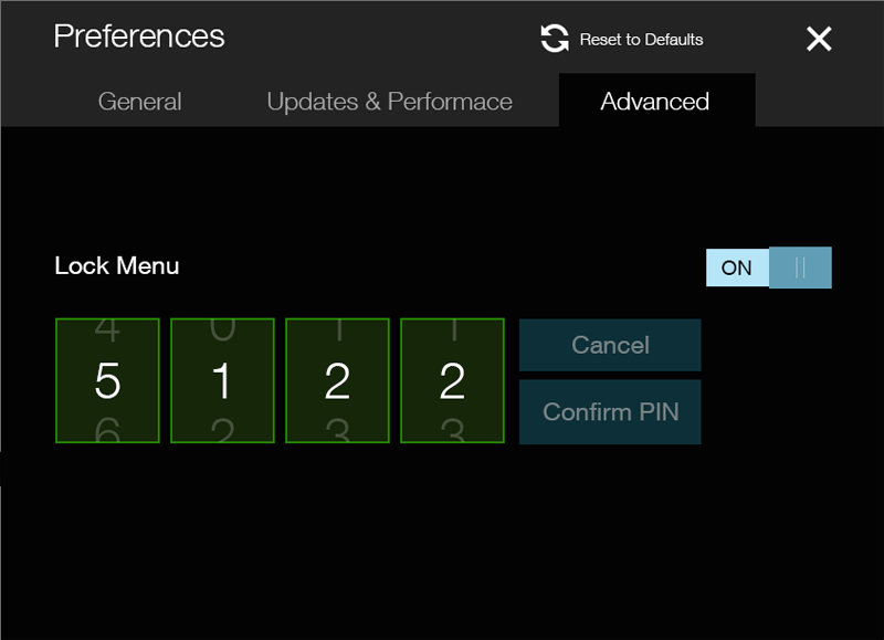
Recently, we created a component that allowed the user to set a numeric code. We have a keyboard that can pop up on demand, so using the keyboard was our first impulse. Upon a second look, however, we saw that using a scrollable number picker (shown above) would eliminate the need for the user to bring up the keyboard, making this option a more touch-friendly solution.
2. Are we asking users to act on a button/buttons to manipulate content when they could instead act directly on the content itself?

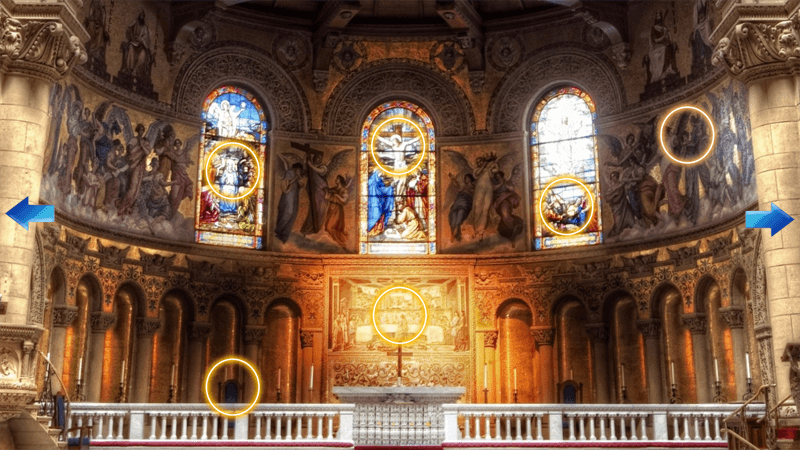
We wanted to show that the user could pan the screen to see more content. When coming up with a solution we at first added arrow buttons (shown above) to indicate to the user that they could pan the screen. But, the arrows were visually distracting and corny. So we replaced them with a hint animation of the screen moving slightly, which indicated to the user that the screen could pan. This was a much more elegant and subtle solution that prioritized the content over the interface controls.
Always Strive for an Effortless Experience
By removing virtual controls, such as buttons, you can increase the touch-friendliness of your large touchscreen application. The bottom line is that when using the hand with touch interfaces, swiping is more comfortable and natural than tapping. Acting directly on content is more akin to what humans do in the physical world than using buttons to perform actions.
So, if you’re designing a large touchscreen kiosk, look to mobile rather than desktop UX for inspiration. The results will be much more touch-friendly.