Want to Empower Touchscreen Users? Let Them Choose Their Own Layout
Most of our everyday experiences with touchscreen technology are interactions with small screens, such as phones and tablets, where screen space is at a premium. At the opposite end of the spectrum are large touchscreens, which offer User Experience (UX) designers plenty of real estate to work with.
To utilize that space, you can enlarge the content or display more content on the screen at once. That’s nice, but it’s just scratching the surface of what a UX designer might do to make use of this valuable affordance.
Lessons From Desktop UX
In what other ways can a designer utilize a large touchscreen to satisfy users?
To answer that question, I look to other large-screen experiences, specifically the desktop experience — how mouse-enabled desktop screens have taken advantage of greater screen space.
Applications in desktop environments utilize screen space in a way that mobile apps do not. They allow users to configure windows, windowpanes or widgets so users can see content or work with tools in an arrangement that suits them. This ability to customize the screen layout is an idea that can transfer directly to large touchscreens.
In contrast, apps on small touchscreens such as phones rarely allow users to arrange screen elements to their liking. The layout is fixed, simply because there isn’t enough room for many elements or arrangements to fit on a single screen. The screen space is so small that there is not much advantage to customizing a layout.
For example, if you use Skype on your desktop you can have multiple windows open, arrange them and make some larger or smaller, to see exactly what you need at any given time. By comparison, in the Skype mobile app you can see only one window at a time, at one size.
It’s clear that one affordance of larger screen size is a user’s ability to arrange the layout of content to his or her liking. How can designers apply this advantage to large touchscreens?
Have It Your Way
The precision of the mouse comes in handy when users reconfigure the layout of a desktop application. With touch technology there's less fine-grained control because a finger is larger than a mouse pointer. Also, a mouse can have roll-over cursor changes to indicate hot spots and the cursor can hint at the action that can be performed. Touch does not have roll-overs or cursor changes.
How does that impact the way you design interface elements in a customizable layout?
For touchscreens, users need a visual clue to let them know there are movable elements. The hot area needs to be larger to accommodate a finger rather than mouse. The payoff: dragging with the finger to move or resize is easier for the hand than the mouse, and rearranging layouts can be satisfying for users.
Grid Viewer Example
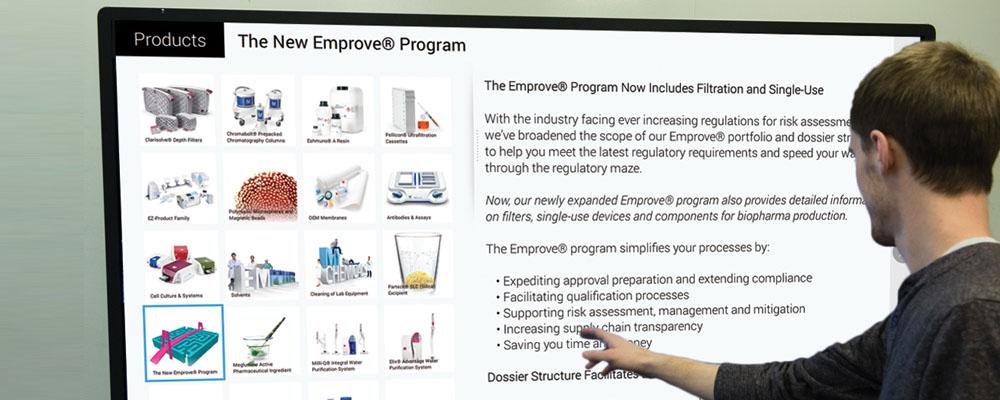
We have developed some user-configurable layouts on our touchscreen authoring application, ViewPoint. Below is an example called Grid Viewer. It allows the user to view a grid of thumbnails that act as a visual table of contents to more detailed content.
When building Grid Viewer, we first provided a visual clue that there was a moveable element — a grab bar that is always present on the screen. Although there is plenty of room for a finger to touch the grab bar, we simplified the experience by making the entire right panel grab-able. This way, the precision to touch only the visual grab bar is not required. Notice that both sides of this panel can scroll vertically, which works well with touch.
The result? It’s easy for the user to change the size of either side of this panel, which makes reading the content or finding a particular item effortless.
User-Customizable Design
Desktop applications have allowed users to customize screen layouts for years. Mobile devices, with their small screen sizes, don’t afford much arrangement of layouts by users. But, large touchscreens present an exciting opportunity for designers to create clever, appealing, touch-friendly customizable layouts.
Whether designing for desktop or touchscreen, your goal as a UX designer is to allow users to interact with content in a way that works well for them.