Usability and Modern Visual Design: An Effective Harmony
Where did the buttons go? Significant aspects of modern visual design have made a huge impact on the development of graphical user interfaces across web, mobile, desktop and embedded systems. While flat-design holds many attractive qualities, implementation of the style has potential to undo usability principles formed through decades of extensive research in the field.
The flat-design approach has gained increasing popularity for its overall simplicity in layout, color and iconography. Although this new design trend breathes a fresh aesthetic into the digital space, applying the simplistic flat-design should not be done simply. The flat-design approach, in some cases, may threaten the usability of a user interface. This in turn puts a heavy strain on the given product’s success, and this is not good for anyone involved from business development to the consumer. If a product’s target user(s) cannot intuitively use the product and has/have a poor user experience, the product is in trouble. Shortcomings here carry varying severities of consequences depending on the application. These insights accentuate the power of visual design and the importance of adhering to user-centered thinking and principles in conjunction.
With this in mind, there are a vast number of aspects to analyze, but I’d like to highlight some of the fundamental challenges. The flat-design approach threatens positive usability results with the decrease or even elimination of perceived affordances, which is particularly evident in the navigation and interactivity of a given graphical user interface. Where did all of the buttons go? How flat is too flat? In some instances, icons themselves have transformed into the primary indication that an item can be clicked or tapped. This is a dramatic shift from the not-so-distant skeuomorphism design aesthetic, which exemplifies an approach to perceived affordances by way of often exaggerated, visually three-dimensional elements on screen that correspond to their real-world counterparts.
Good product design bases interaction models on previously learned or expected experiences. The three-dimensionality of skeuomorphism attempts to bring familiar imagery and metaphors into the digital space that make a user interface more relatable and easy to use. A perceived affordance shows us what actions are possible while viewing certain screens and utilizes visual cues to help the user understand their digital environment. The goal is to convey the interactivity of a given user interface element by simply looking at it, rather than having to learn it. This way of thinking generates the most intuitive products and begs for there to be a mutual sweet spot between flat and more descriptive visual elements that will really drive user interface design as a whole into new territory.
Furthermore, how do we push visual design without compromising usability? It is important to keep the intended goals of a user interface in mind throughout the entire design process. Each visual element embedded should only be added if it is going to have a complimentary impact on the user experience. When working within the flat-design style, there are several ways to use the style to your advantage:
- Creating a simple layout with a concise information architecture will naturally benefit a user’s ease of comprehension.
- A visual balance for each section of the layout should be organized by function, grouping together elements and information that demand a common focus.
- Applying color can help drive comprehension home, giving certain elements appropriate emphasis. Deciding which elements need emphasis will depend on the goals at hand and should be done so consistently across the entire user interface.
- Use a set bank of visual signifiers so the user can associate certain icons, colors, or arrangements with certain tasks and actionable items.
- Clean iconography, limited color palettes, and focused information will further benefit a user’s cognition of a user interface as a whole, making it that much easier to understand, use, and explore.
- Incorporate animation/motion graphics in a way that compliments the intended interaction goals.
Adding animation to a user interface can significantly advance usability if applied correctly. Three-dimensional buttons that appear to depress into the screen produce a high level of user confidence. Using animation for user feedback, especially within flat-design, inspires that same confidence in action and navigation in a different yet equally beneficial way. One of the biggest challenges is avoiding unintended attention shifts. Adding animation should be done with elegance and subtlety, providing emphasis when and where it is really needed.
Motion graphics animation, in conjunction with flat-design, can further assist in simplifying a user interface. For instance, the use of engaging animation allows the user interface to introduce only certain items and elements when they are needed, reducing visual clutter when they are not. Motion graphics animation has the power to help guide users through an interface, staying one-step ahead that can generate absolute delight in use.
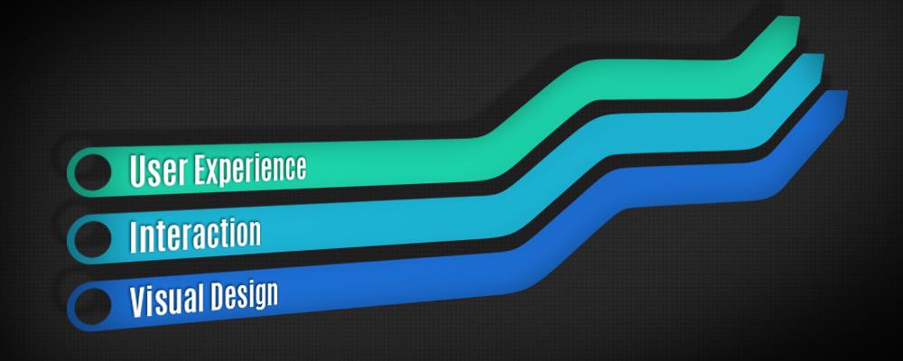
Although this article hones in on the front-end and direct user impact, it is important to recognize that there is so much more to this field of practice as it relates to the design evolution of a given product rather than product design evolution as a whole. Considerations for development, for instance, should be in focus throughout the design process as well. The aforementioned guidelines can also be applied more generally to user interface design across the board and each holds a great depth of capability. Specifically, the flat design style can be truly beautiful and functional if implemented sensibly. The key insight is that the culmination of user experience, interaction and visual design of a given product should be built in tandem and mesh harmoniously for the greatest usability effectiveness.