Tap, Tinder and Touchscreens: How Swipe Can Improve the User Experience
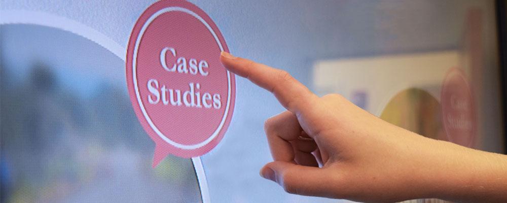
Tap is the safest touch gesture. Everyone understands that tap equals click. On a touchscreen, you tap where you would have pointed and clicked on a mouse-enabled display. Tap is a simple, deliberate gesture. The presence of a button-like element is indication enough that it can be tapped, and will likely mean yes or no, save or cancel, choose this thing or navigate to this new place.
Swipe, drag and pinch, on the other hand, have less clarity. How does the user even know when they can swipe, drag or pinch? Does swiping mean navigating or removing? Does drag mean see more or refresh? Are these gestures one-directional or omni-directional, and do different directions mean something?
These touch gestures can be more than confusing to utilize in interaction designs. They can even incite controversy within the user experience (UX) community.
Tinder sparked heated debate in the UX community a few years ago when the dating app unveiled its most recognized UX component. Yes, I’m talking about the infamous ‘swipe right or left’ interaction. In the Tinder experience, the user is presented with a stack of choices. Swiping left means reject while swiping right means accept. Designers hotly discussed the merits and drawbacks of using touch gestures like swipe that have novel meanings. Would implementing unfamiliar ways to use touch gestures create too many issues for users? Would staying within established gesture norms – think tap – be advisable from a business standpoint?
For Tinder, the answer was clearly no. The freshness of their use of swipe helped build its brand into a billion-dollar behemoth.
As a UX designer who has observed scores of users interacting with touch devices, I applaud Tinder and other apps that experiment with unfamiliar touch gestures in incrementally new ways. While I’m not suggesting a free-for-all on unique gestures, I have come to believe that some gestures, such as swiping, dragging and pinching, are generally more effortless and desirable than tapping.
This may seem counterintuitive because tapping is so simple and straightforward while other gestures are more involved, requiring greater manual dexterity. But, I have found that repeated tapping is tedious, tiresome and boring – and therefore, less engaging from a UX standpoint – than more complicated gestures. Here’s why.
The hand is naturally complex and expressive. The 27 bones, 34 muscles and 48 nerves that make up the human hand together are capable of enacting shape, pressure and speed in an infinite variety of ways. Confining a hand to the tap gesture severely restricts the innovative ways interfaces can leverage the sense of touch to control digital devices.
Small targets are tough to hit. According to Fitt’s Law, the time required to rapidly move to a target area is a function of the ratio between the distance to the target and the size of the target. Essentially, this means large targets are easier to hit than small targets. Swiping and dragging use large targets because the gestures typically affect a full screen or sizable asset, thus reducing the effort required to hit the target. On the other hand, buttons and other assets that users are asked to tap are often small and thus require more effort to accurately land a finger on them.
Pointing isn’t as natural as it seems. Tapping, which is essentially pointing with an outstretched index finger, seems like a natural gesture – but it’s an illusion. How often in real life do you actually point with one rigid finger, except when using poorly designed electronic devices? We think of pointing as natural while explaining something, but it is not really so. Though pointing is a common and instinctive motion when conveying information to others – I point all the time when discussing work with fellow designers – it is rarely done with just one finger. If you watch people in real-life situations, they typically use two or more fingers or a whole hand to draw attention to something. In other words, people instinctively use their hands in more fluid and varied ways than rigid pointing.
We use myriad gestures to interact with our surroundings. Observing how humans interact with physical objects offers insight into natural gestures that our hands and minds are comfortable with. Watching people manipulate books, papers and other artifacts, I notice a lot of gestures that employ multiple fingers or the entire hand, and mimic swiping and dragging rather than repeated rigid pointing. This doesn’t mean interfaces should attempt to imitate or recreate the physical world in digital form – that would limit so many possibilities of the technology. But it does mean that, as designers concerned with creating empowering and compelling UX experiences, we should consider using gestures that are innate.
Touch is too powerful to be limited to tap
While tapping certainly has its appropriate uses in UX design and is unlikely to disappear from the lexicon of touch gestures, swiping, pinching and dragging are more natural movements and should be given deep consideration when creating any type of touch-enabled device or app.
The bottom line: if you are overusing the tap gesture, it’s time to re-evaluate your design approach. Touch is a new frontier.