Rapid Development of an In-Vehicle Infotainment System (IVI): A UX Perspective
With the recent announcements of Apple’s CarPlay® and Google's Android Auto In-Vehicle Infotainment Systems (IVI), in-vehicle systems in general have recently been pulled from relative obscurity into the limelight. IVIs are becoming a much more integral part of everyday life with people spending more and more time in their cars. Having an easy to use system that integrates with technology you are already using (e.g., Smartphone, MP3 player, Tablet, etc.) lets you better enjoy your driving experience.
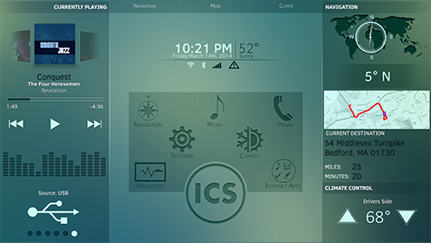
In this article, I want to introduce a recent user experience (UX) project and the challenges presented to the UX team under accelerated timelines. We worked with the development team to create an integrated user interface (UI) component for this IVI system.

The Project:
The objective of this project was to design and develop an IVI demo to be used by a large tech industry leader. To be clear, this project was completed under an EXTREMELY compressed timeframe. It took nine weeks from kickoff to completion of this project. Within that period, we needed to design, develop, test and implement a working demo on the client’s proprietary hardware platform (which we had never seen before) to be shown at an auto show in early June.
The Purpose:
The main purpose of this demo was to show the power of the client’s hardware platform. This meant that we prioritized graphics and cool effects with the knowledge that not all of the functionality would meet federal motor vehicle safety laws. The client wanted the demo to show as much functionality as possible and have high quality, dazzling visual effects.
The Approach:
The project used an Agile approach to design and development, with a heavily modified UX design plan. Initially, we planned to start by having the visual designers create their designs first and then they were to be critiqued and modified by the UX designer to make sure that their designs were at least functionally usable. Once the changes were made, we would send them to the client for approval prior to sending them to our developers for implementation. While this goes against the normal UX design approach, it was a valid approach due to the timeframe and the advanced skill sets of our visual designers.
Challenge #1:
While this approach would have worked in theory, this plan had to be abandoned by the UX team early in the project. In order to meet the compressed timeframe, the developers needed to start working on certain elements of the user interface (UI) much earlier than expected as some of the elements had yet to be designed by the visual designers. Because of this, they needed at least some sort of base wireframe with which to begin. The UX designer then had to jump ahead of the visual designers and create wireframes from their very early designs and from scratch.
The Fix:
Given that the compressed timeframe did not allow for the ideal upfront planning of the UX portion of the project, the UX team rose to the occasion and designed the three main sections of the demo, the media, phone and climate control within the same development sprint.
Challenge # 2:
Our second major challenge was timing the UX designs to the needs of the development team. At times, the development team would need assets or designs for part of the project that had not been created yet. Since the development team could not work on prototypes without designs from the UX team to base it on, we were able to accelerate the process and create preliminary wireframes for the developers to begin their phase of work. While not having the final wireframes to start slightly delayed the software development portion of the demo, we were able to make up time later in the project.
Fix #2:
As this project was accelerated, it also increased the number of rapid challenges that arose during this strict timeline. Based on our experience we were able to anticipate and quickly move through many of those issues that under ideal timelines may not have appeared or presented as a challenge.
The Final Product:
Even with the issues that we faced, we were able to deliver a finished demo to our client on time and beyond expectation. The client was very happy with the demo they received and follow on work to produce a more robust version is in the works. Overall, the project ran smoothly especially having such a compressed timeline and the client was very pleased with the results.