Internet of Things: Designing a User Experience for No Learning Curve
The user experiences (UXs) of Internet-enabled devices that are part of the Internet of Things (IoT) are expected to require little or no learning for users to be effectively proficient with them. As these devices proliferate, it’s inconceivable that users will have any patience to figure out complex or confusing user experiences. This is particularly so with public devices where the time that any one user might engage with a device is measured in minutes.
How does a designer deal with this dilemma?
To add to the challenge, many of these connected devices are not built upon platforms that have existing UX standards, such as iOS, Windows or Android, which have pre-designed solutions to many interface functions. Instead these connected device UXs need to be designed from scratch. Designing an IoT user experience may be best achieved by looking across existing platforms and considering the web, and then replicating the most commonly used and understandable UX patterns. Since touch is the primary modality used on the IoT so far, mobile platforms and mobile websites are better references than desktop applications.
Easily Recognizable UX Patterns
In designing public kiosk software at ICS, we have found that it is easiest to find specific, isolated functions that are commonly understood by a wide range of users. These patterns have become common and are easily replicated in a generic way (not Apple, Windows, or Android specific).
For example, presenting a stack of photos immediately elicits the belief that you, the user, can push them around and probably change the orientation and resize them.

An input field – essentially a box with a label – particularly in the context of asking the user for some data, appears to be universally understood.

Cancel or close also presented little problem, although location of these elements could add confusion if it wasn’t carefully thought through.

This is not a comprehensive list of the easily recognized patterns, so I’ll stop here to compare to the not-so-easily recognized patterns.
Not-So-Easily Recognizable UX Patterns
It has proved more difficult to find navigation patterns that are both very clear, and don’t immediately seem like a direct copy of the web or a specific OS platform. Navigation patterns, more than isolated functions, appear to define the UX as belonging to a particular existing platform. Also, navigation schemes appear more graphical user interface (GUI) specific (as in menus and tabs) harking back to desktop/office metaphors.
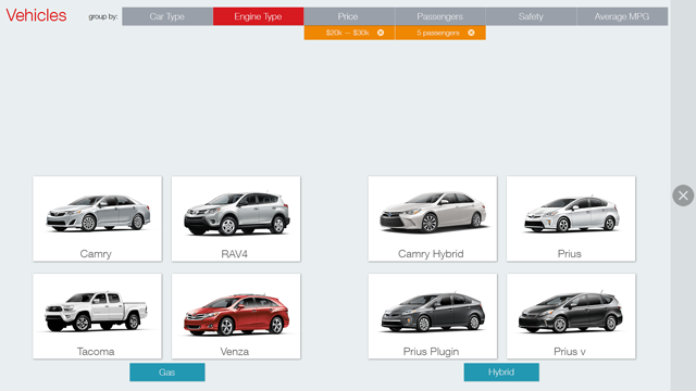
Navigation patterns immediately suggest complexity or density, which tends to be counter intuitive to the use cases of most IoT devices. Here is a solution we came up with that is essentially tabs made to pop visually. It is however, a bit of a cheat solution to try to obscure a GUI convention, in my opinion.

Human Recognizable Patterns
Is it possible to find non-computer “patterns,” (or signs and symbols) that elicit the desired response from a user? In other words, in an attempt to create universally easy to use devices, can we utilize some things that we understand about instinctive responses or our biological capabilities? For example, the color red is the easiest color for humans to see and therefore stands out the most in a field of colors. No wonder that red has become the color to use to indicate errors or to direct a user’s attention to an important item. (See my earlier post: Seeing Red - Why Red Is a Good Contrasting Color for an Effective User Experience)
I believe this area of human instinctive responses and biological capabilities will increasingly pique interest for UX designers, as the IoT grows and users expect to reduce their time figuring out how to use a device and navigate its UX.
Watch for upcoming blog posts from me in this area.