Focus on Usability Can Limit Medical Device Recalls
This blog launches our new series on software design of medical device user interfaces (UI), which will explore usability, safety, risk management, key regulatory standards, usability testing, and wearable medtech user experience (UX) design.
Building great software has always been challenging. Building software that safeguards patients while flawlessly controlling sensitive embedded and connected medical devices — from room-sized proton radiation systems to portable automatic external defibrillators (AED) — magnifies the challenge. It should be no surprise that design issues cause many device recalls.
So how do you mitigate potential problems when designing a medical device user interface (UI)? Begin with a strong focus on usability.
The Importance of Usability
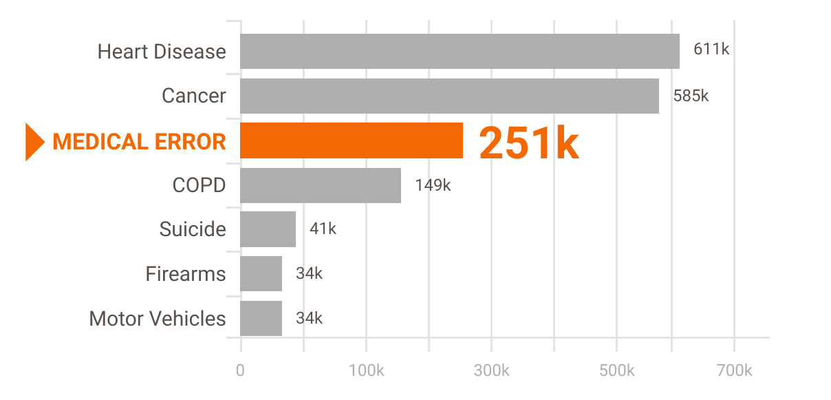
According to researchers Martin A. Makary and Michael Daniel of Johns Hopkins University, medical error is the third leading cause of death in the U.S.[1] They put the number at approximately 251,000 deaths per year. Many of these deaths (as well as non-fatal injuries) are caused by "misuse" of medical equipment.
Leading Cause of Death in U.S.

What causes misuse? According to researcher D. Jeffrey B. Cooper writing in BMJ,[2] although the incidence of outright functional equipment failure may be low, "machines can have shortcomings or faults in design that encourage human error."
For example, the Food and Drug Administration (FDA) reported that between 2005 and 2009 infusion pumps and related devices accounted for 35% of medical errors that resulted in significant patient harm. The agency said a large number of the adverse events stemmed from "programming errors attributed to poor device usability." Essentially, that's human error arising from a poorly designed UI.
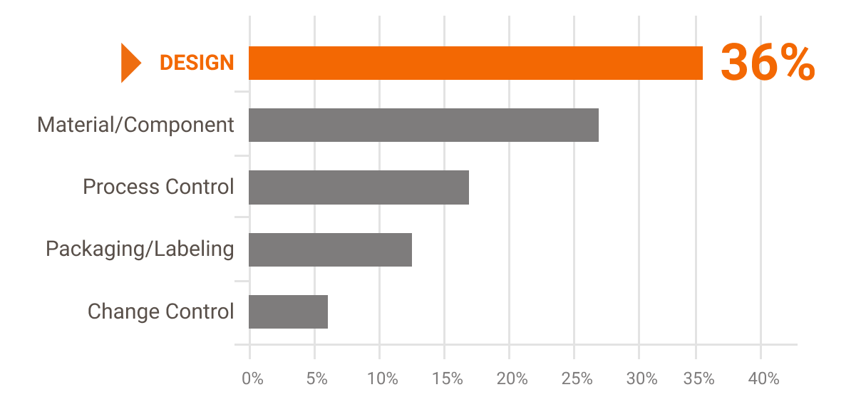
Design problems (relating to both hardware and software) accounted for more than a third of overall medical device recalls — with a large proportion of recalls traced to usability and the design of the user interface. Here's an example: because of a confusing UI clinical staff enters patient weights in pounds rather than kilograms, a mistake that results in medication overdoses. [3]
Causes of Device Recalls in Fiscal Years 2010-2012

The mismatch between user needs and the design of the device's UI is the likely cause of unintentional use errors. According to Human Factors Engineering – Design of Medical Devices [4], medical devices that are not designed with usability in mind are frequently "unsafe, prone to use error, difficult to use, difficult to learn to use, or detract from user efficiency or satisfaction."
And according to the FDA, making design modifications to a device and its UI are generally the most effective means for eliminating or reducing these types of use-related hazards. So, applying usability design techniques is one of the best ways to guard against use errors and the harm they can cause.
What is Usability?
Usability is defined as the ease of use and learnability of a designed object. Highly usable device controls function like a lens that makes information and processes crystal clear, allowing users to stay focused on their work. Usability results from user-centered design, a discipline that has evolved along with the software industry. User-centered design makes technology serve human clinicians and patients rather than making humans strain to adapt to the technology.
It may seem obvious that usability should be a top priority for medical devices. But, unfortunately, devices with poor usability still find their way into the market, posing serious risks to patients.
Here's a chilling real-world example [5]:
At 4:30 pm on Feb. 27, 2000, a heavily pregnant Danielle McCray was admitted to Tallahassee Memorial Hospital for what should be a joyous event: the birth of a child. To ease the discomfort of labor, at 6:45 pm that evening she was connected to a patient-controlled analgesia machine, a programmable infusion pump.
Just eight hours later, at 2:30 am on Feb 28, instead of delivering a healthy baby, McCray was pronounced dead from a morphine overdose.
How did this happen? While human error was cited, the facts of the case point to deeper issues with the infusion pump's usability and UI design. For instance, the pump required up to 27 programming steps. How could someone reasonably have been expected to safely operate this device?
And McCray and her care team were not the only ones who had issues with this device. During a 12-year period, improper programming of this pump caused at least 65 deaths, with estimates suggesting that as many as 667 people may actually have died using it.
Human error had caused 68% of the fatalities and serious injuries associated with this device. The manufacturer had received prior warnings, including one in 1996 calling out potential interface issues, and another in 1997 suggesting the device was "susceptible to misprogramming."
Though the device maker's view was that the problem was not the design, but rather lack of user training, the company agreed to make design modifications to the UI. These included:
-
A dialog structure with fewer steps
-
A dialog overview showing the user's location in the programming sequence
-
Better command feedback
-
Easier error recovery
-
Clearer labels and messages
Old device interface (L) vs revised interface (R)

The results of these design modification were dramatic. The number of required programming steps decreased by 55% and user errors dropped by 56%. Most significant, the specific programming error that had been linked to patient deaths was eliminated. Clearly, usability and effective UI design matter.
Are You Asking the Right Questions?
If you want to bolster usability, start by asking the right questions — and then test carefully. (Usability testing — a requirement to ensure the device is safe and meets government standards — will be covered in a future blog.)
Here's a brief list of some questions to ask, which are applicable to an existing device if you are considering creating a generational product or to a high-fidelity prototype if you are developing something new.
-
How easy is it to learn to use the device?
-
How soon will the intended user feel comfortable using the device?
-
Once learned, how efficiently can the device be used?
-
Do users remember how to use the device after several days, weeks or months of non-use?
-
Does the device prevent users from making errors or help users recover from their errors?
-
Is the device design appropriate for the capabilities and limitations of users?
-
Are users satisfied with the device?
Getting the right answers to these questions requires a disciplined, user-centered approach to design. This means applying the right expertise at the right time in the product development cycle. As we have seen, failing to do so can have tragic consequences.
The Takeaway
When designing medical devices, always remember: the goal of clinical users is to improve patient outcomes. Period. Prioritizing usability and incorporating a user experience carefully designed to mitigate user error is the path to success.
Stay tuned for part 2 in our series, UX Design for Medical Devices. In the meanwhile, you can read more great UX design content here.
References
- Martin A Makary, Michael Daniel, BMJ, May 2016
- https://qualitysafety.bmj.com/content/11/3/277
- FDA white paper, Infusion Pump Improvement Initiative
- HE75 a.k.a. ANSI/AAMI HE75:2009/ (R)2013
- Vicente, 2006