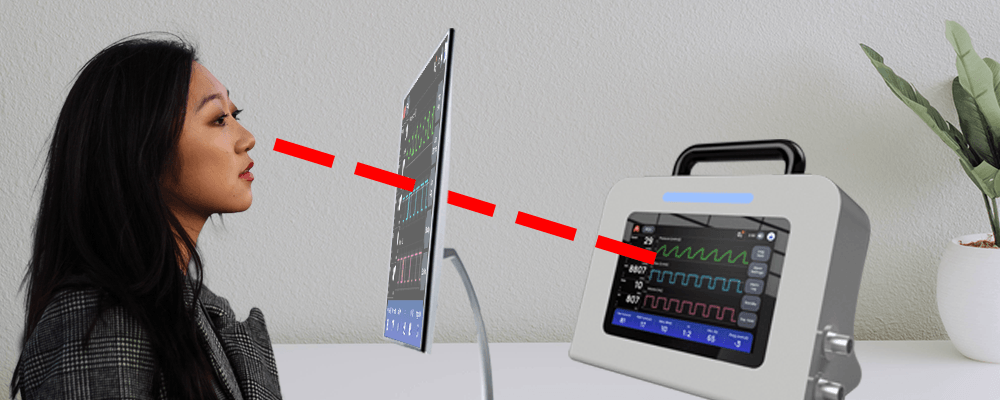
Do My Eyes Deceive Me? Hardware Impacts Perception of Color
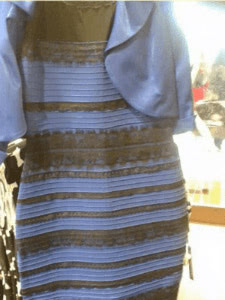
Early in the year of 2015 (800 B.C. in internet years) millions of friendships were ruined, culture wars destroyed, and trust was betrayed over one polarizing photo of a tacky looking dress.
This low-quality digital photo was perceived differently by virtually everyone who saw it. Was it gold and white, or blue and black? Judging from this image alone, I was convinced it was gold and white. I genuinely believed that anyone on team “blue and black” was being a contrarian for the sake of looking like a big-brain intellectual.
Delighted by the free publicity and marketing, the dress’ designers, Roman Originals, later confirmed in a tweet that this dress is in fact blue and black.
Mind blown.
Factors Influencing the Perception of Color
In my job as a visual designer, I face this type of color confusion all the time. I’m deep into it right now, in fact. I’m working on a ventilator called Project RED, which runs on a low-cost Raspberry Pi and incorporates a Sunfounder touchscreen to display the user interface (UI).
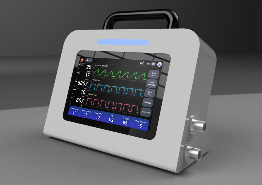
After much discussion, the client and design team unanimously agreed that the ventilator UI should have a blue and black theme, similar to #thedress. As such, we designed a simple, clean UI featuring a black background, primary buttons in a rich, corporate blue, and secondary buttons colored gray with a blue hue.
At least, that’s how the colors appear on most computer screens.
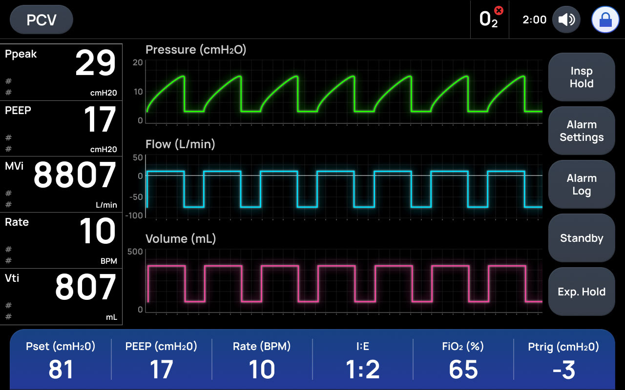
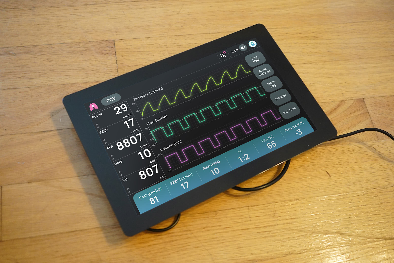
Project RED Ventilator: Waveform Screen
But, individuals can perceive colors very differently depending on a multitude of factors — including the screen on which the color is presented. And that’s where things got complicated.
Being sensitive to small color variations is a requirement as a visual designer. I notice slight differences in color output between my laptop screen and the larger auxiliary monitor that’s attached to it. Because of this, I always make color testing a priority. While presenting color accurately is essential for all design projects, it is particularly challenging when working with embedded devices, rather than laptops or desktops, because they typically feature unique hardware and software.
To ensure that color for Project RED’s UI was accurate and matched what the team had agreed upon, I insisted that I get my hands and eyes on the actual technology the ventilator would ultimately run on when being used by doctors and nurses. A few days later, with Raspberry Pi and Sunfounder touchscreen in hand, I was able to see for myself how Project RED’s perfectly balanced colors appeared on the commercial-device hardware.
I was horrified.
Gone was the reliable, familiar blue. Instead, the color looked more like a washed-out puke green.
My job was to fix this. And fast.
The actual color correction was the easy part. To cancel out the green, I shifted the blue color farther away from the green part of the spectrum, and moved it more toward purple. I also darkened and saturated the color of the buttons so they’re more distinguishable from the background and the text colors.

I presented this new palette to the development team and client. They were…confused, even a little outraged, at this color change. It was drastically different from the original they had approved.
CLIENT: We thought the color blue might be off a little bit, but this is an entirely different color! Can you make it blue again?
ME: Nope. (To be fair, I was more diplomatic but that was the essence.)

I completely understood where they were coming from. The new image I gave them looked nothing like the original so naturally our stakeholders were hesitant to approve this change.
But the change was absolutely necessary in order for them to get the ultimate result they were looking for. I had to show them why the color change made sense.
Decide for Yourself
I couldn’t just photograph the touchscreen device and email an image to the team (like most tech workers during the pandemic, we’re virtual for the foreseeable future) as that process would cause just as much confusion as #thedress. Thanks to the variety of available graphics cards, everyone’s monitor shows color in a slightly different way.
Instead, I encouraged everyone who had access to the embedded hardware to test it out on their own Raspberry Pi and Sunfounder touchscreen. See for themselves.
I explained that color tuning is a normal part of the device development process, and offered to revert back to the original blue if they still preferred it after conducting their own test.
The consensus after testing: the purple color selected to replace the original blue actually appears to be a sparkling, clean blue on the touchscreen — exactly what the client was looking for.
Your Eyes Play Tricks
Photographs, variable screen displays, even our environments can easily trick our eyes and brains into believing things that aren’t real. That’s why we make such a strong effort to examine the UIs we design on not just our desktops, but on the target hardware whenever possible. To deliver optimal results, we need to see for ourselves how our designs are perceived on the actual product. That’s one way we ensure we deliver the best customer experience.
For more on UX design, click here or visit our UX design studio Boston UX.