Designing in the Dark
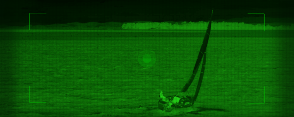
When most of us hear night vision goggles, it is usually a safe bet we imagine a night scene with that glowing green-scale overlay or something similar to that shown above. For those who have ever used night vision goggles or have used a digital camera with a night setting, you might already be familiar with this concept, but it really does look like this! Have you ever wondered why the exclusive use of green? Quite often, movies and video games embellish the reality of technological devices, but these intriguing green-scale displays are very real and there is actually some science behind it.
Now this is nothing new, but there is much more to color theory than picking your preferred hue. Color theory use is easily overlooked and can have negative consequences when it is not applied correctly.
Our retinas contain rods and cones, and are the tools we use to receive light and color. We use rods for low-light (scotopic) and cones for color at higher light levels (photopic). Photons enter our eyes at varying wavelengths and are chemically converted by our rods and cones into our perception of color. Our eyes house three types of cone receptors corresponding to short, middle, and long wave sensitivity. Blue has the shortest wavelength and red has the longest, while green is in the middle. According to the International Commission on Illumination (CIE), the Luminosity Efficiency Function shows us that the human eye is most sensitive to green on the spectrum of visible light. The scale goes from ultraviolet to infrared with optimal visibility in the middle, and this is where green is most prominent.
So what does this mean for UI displays at night? Both the rods and the cones are needed, the rods to perceive the low levels of light in the environment, and the cones to see the color and details on the displays. This means that the application of color must be used efficiently if it is going to be perceived by the cones without disturbing the sensitivity of the rods in the dark or low-light environments. This also means that managing the brightness of light and color in these situations is complicated and should be done carefully. With our eyes highest sensitivity to green, we need less of it when compared to all other hues in the spectrum. In other words, green requires the least amount of energy to be seen, which is quite useful in cases where hardware design has limiting power constraints. In the case with night vision goggles, these are often powered by on-board batteries. One can imagine, in scenarios where mobile night vision is crucial to the task at hand, the users will most likely be keen on stretching battery life as long as possible. Hence, the power of green!
The usage of green and red has been widely adopted for the design of user interfaces in low-light conditions for some time, most commonly found in aviation and maritime systems. Green will always win the energy battle over red, but red also provides a worthy benefit to low-light environments. One of the primary goals for low-light UI design is that one light should not blind you from being able to see another. The use of red ambient light for instance, allows our eyes to focus on certain things while maintaining night vision when focus is averted elsewhere. This lighting concept is also used in dark rooms for developing analog film.
As I mentioned previously, the science behind the application of color in low-light environments has been in practice for some time. However, unless you work in the domain where these conditions come into play, you may never know why night vision goggle displays are green. As a UI/UX designer, I have found research into this area of color theory fascinating and useful for a wide range of projects. If you’d like to learn more, I recommend checking out the wealth of knowledge provided by the Color Usage Research Lab which is powered by NASA Ames Research Center.
Reference:
Color Usage Research Lab, NASA Ames Research Center website, last accessed November 30, 2015, http://colorusage.arc.nasa.gov/index.php