Connecting Consumers - Designing User Experience the eBay Way

Whether you are designing the user experience for mobile, embedded products or a website they all have elements that when applied consistently can make any product or website successful.
One website that most of us are either familiar with or have used is eBay. The online auction and buy-it-now site has been around since the mid 1990’s, and has millions of users (as of a year ago, there were approximately 84 million active, registered users (1). This is a website that many people from various technical and non-technical backgrounds can and do use daily.
Some people use eBay stores to supplement their brick and mortar store in order to reach a wider buying audience. Other people use eBay almost exclusively as their source of income. Thousands (perhaps millions) (2) of sellers and buyers use this system every day to list, sell and buy merchandise.
So what is it about the eBay experience that enables so many people to use the site well? The eBay audience is unique in that it transcends every single typology and demographic. The experience is designed to engage users in an experience that they love and which builds trust, rather than to entertain. In 2013, user trust and the user experience on eBay translated to $16B in U.S. annual revenues alone (3).
We might easily come up with dozens of good design components to discuss. For the purposes of this article, I want to focus on three design choices that I think make some of the largest impact on the usability of the website - consistency, a focus on content and a clear format.
Consistency
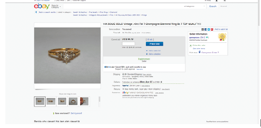
First, the website is designed with consistency in mind. All search results and listings follow a general template. So buyers always know where to look to find item information, whether it’s price, time left, or the item title. Once a buyer has opened a listing, they get additional information, such as the seller’s name and feedback rating, and various possible actions (such as Place Bid, Buy it Now and Add to watch list).
Content, Content, Content
The content is the star of each page. For example, a page of listings has the content on the center of the screen, with navigation surrounding it. Once the buyer opens an individual listing by clicking on it, that listing becomes the star. The listing screen is roughly divided into thirds - the picture, item information and seller information.

source: eBay.com
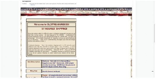
This information has a standard look and feel across eBay. As the potential buyer scrolls down the page, they can enter the customized portion of the listing. This is the area where a seller, particularly a high volume seller, can introduce their store branding.

source: eBay.com
Clear Easy-to-Read Format
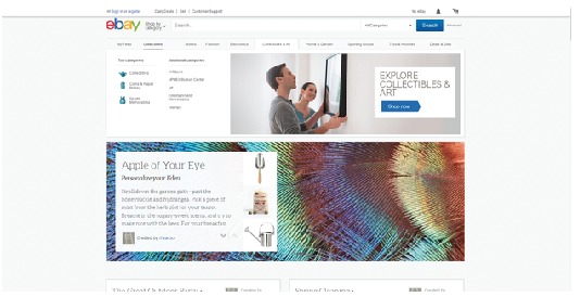
eBay’s home page is clean and uncluttered, and uses large and colorful images to attract potential buyer’s attention.

source: eBay.com
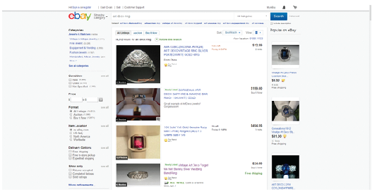
eBay also presents a lot of data; in one search there were over 14,000 results. However, the page design uses white space to group.

source: eBay.com
While these are only three of the items that make eBay user-friendly, they are vital design elements that should be considered when creating and updating interfaces. By creating a clean, clear and easy to use interface, more people from all walks of life will be able to use the system. More than just use the system, people will feel as if the system is working with and for them, leading to an experience of shared exploration and discovery as users navigate the interface. Working with and for the users increases their satisfaction with the experience, and can help drive sales and lead to repeat, happy customers. Just ask eBay with its tens of millions of users in the U.S. and its $16B profit just how important the user experience can be.
References:
1.Wiki.answers.com, accessed May 8, 2014, http://wiki.answers.com/Q/How_many_members_does_eBay_have?#slide=2
2.Wiki.answers.com, accessed May 8, 2014, http://wiki.answers.com/Q/How_many_people_view_eBay_each_day?#slide=2
3.The Wall Street Journal Market Watch, accessed May 9, 2014, http://www.marketwatch.com/investing/stock/ebay/financials
All trademark, trade names and images herein are the property of their respective owners.