Compelling Touchscreen Animations Enhance the User Experience
Building a brand and sharing digital content in a way that resonates can be a challenge. As a user experience (UX) designer, how do you capture and retain the attention of busy audiences in public, private or corporate environments? And how do you meet their expectations for ever more interesting, informative and memorable experiences?
The solution: well-designed user interface (UI) animations tailored to your company’s (or client’s) brand. When delivered on touchscreen-powered kiosks, these powerful animations effectively engage increasingly demanding audiences.
Meeting Customer Expectations
More than a billion people interact with their smartphones each day. Nearly everyone has formed a strong bond with his phone’s interface. In fact, people have grown so accustomed to clever motion design from companies like Apple and Google they now take it as a given that every interaction with technology -- not just their phones -- will be as satisfying. In other words, people don’t just want great design, they expect it.
You can use this expectation to your advantage by creating captivating UI animations for touchscreen kiosks.
Getting Started
As a designer, it is your role to spotlight a brand in fresh ways while respecting the expectations people have when using a touchscreen. If a brand does not have basic motion-design guidelines, it's up to you to establish them. Once they are in place, it’s time to explore the goals of your project -- what do you aim to achieve with your animations? -- and to learn as much as possible about the content, understand the end user, and explore the environment the kiosk will be placed in. It is on this foundation you can build animations that effectively drive attention and deliver the premium experience today’s tech-savvy audiences expect.
Ready to start creating? Great. To deliver maximum impact focus your efforts on three key elements: functionality, consistency and beauty.
1. Functionality
The most powerful animations prioritize functionality. Sure, they look great. But more importantly, they reflect your deep understanding of how a user will interact with your design. Every decision you make at this stage should help strengthen the connection between user and content. For instance, you could build an animated preview of images placed within a large rectangular tile that leads into an image gallery. By eschewing a static button for a dynamic focal point, you’ll provide the user with a more helpful and engaging (hence functional) visual preview of what is to come once the button is selected.
2. Consistency
By applying the same weight and velocity to animated items across the entirety of the touch presentation, you effectively define the relationships between the different components. This consistency gives users a sense of confidence as the interactions feel familiar -- they can anticipate what will happen as they tap, swipe and pinch the different items found within each screen.
3. Beauty
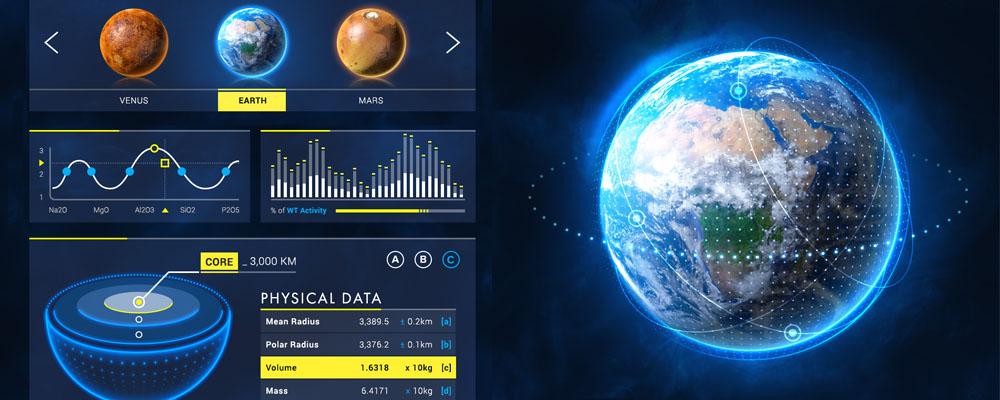
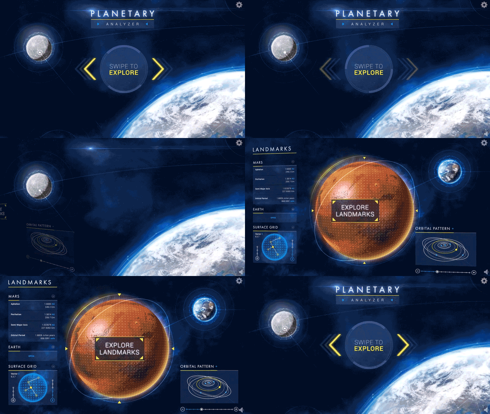
Beauty is the final and typically most fun aspect to address in the animation process. When creating your design, try to think outside the box while focusing on the client's brand identity. Animated backgrounds that seamlessly loop are a great example of elegant design that showcases the beauty of a brand and uses the interface to maximum effect. For instance, if the project’s goal is to highlight the solar system, you might animate the Earth spinning and the stars twinkling rather than just creating a static image of Earth in space. While this design element doesn’t add functionality, it does increase the ‘wow factor’ and more forcefully prompts users to take a closer look at the content. See for yourself in this animation of Earth and Mars.

The Bottom Line
Focusing on functionality, consistency and beauty while designing UI animations is a winning strategy -- and one that’s essential for elevating the user experience. I have designed a number of presentations for touchscreen kiosks. Releasing them into the wild and watching the public interact with the interface has taught me a few important lessons, most significantly this: Authentic, thoughtfully designed animations tailored to a specific brand and UI vastly increase user engagement in both public and private settings.
Observing someone glancing at a cool-looking welcome screen and then walking over to investigate further never gets old!